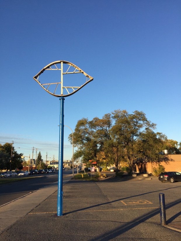
For decades the landmark Dairy Queen sign on the corner of Merivale and Clyde has greeted overheated customers in search of a cool treat at that location’s dairy bar. The sign has now been removed, joining the many other lost classic signs of Ottawa’s streetscape.
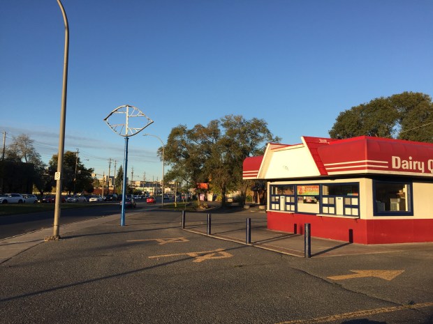
Merivale’s classic Dairy Queen sign.
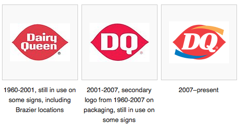
The sign was the second iteration of the Dairy Queen logo used from 1960 until 2001 when Dairy Queen executives decided “DQ” was a cooler moniker for their ice cream shops and started changing all the signs. Ottawa once had an even older sign on St. Laurent, a sign that dated from the 1950s but was removed in 2013 and demolished to make way for the new “DQ” makeover. That sign was famous and rare enough to make the official Wikipedia Dairy Queen page which unfortunately has not been updated to mention that the classic sign has since been trashed.
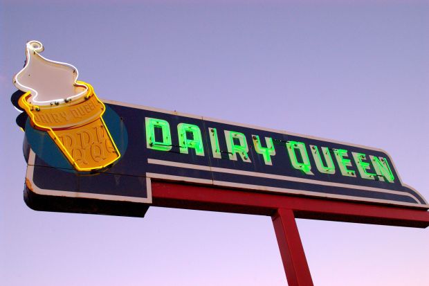
The classic 1950’s Dairy Queen sign that used to be on St. Laurent but was demolished to make room for a new corporate look. The photo is part of the Dairy Queen Wikipedia page.
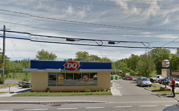
The St. Laurent Dairy Queen after the makeover.
The classic red ellipse sign on Merivale has been in use since 1960, representing the swoop of soft serve ice cream with its pointy ends, but in 2007 the sign was “updated” with fancy new swooshy colours.
I guess it was only a matter of time before one of the last remaining classic 1960’s Dairy Queen signs would be removed to fit into the new corporate image. The location is a seasonal one, so there was no one there to ask about the sign when I visited. This has always been my favourite Dairy Queen, a shining beacon of an era all but lost in time.
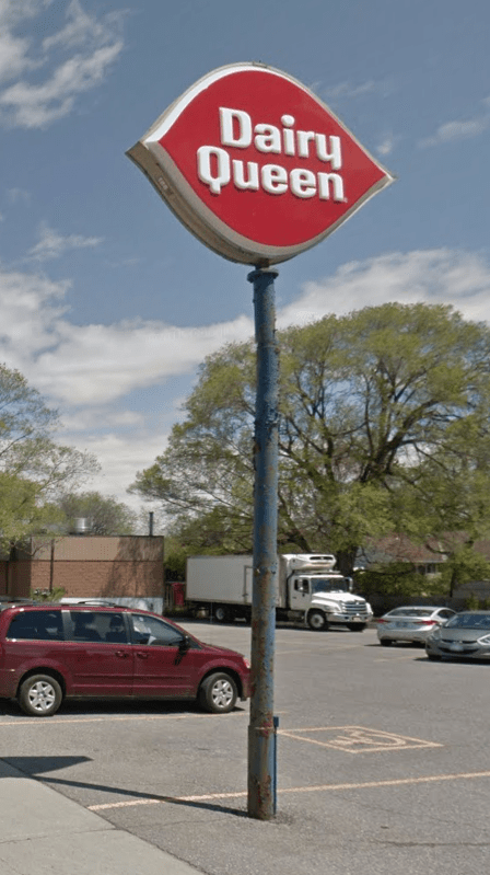
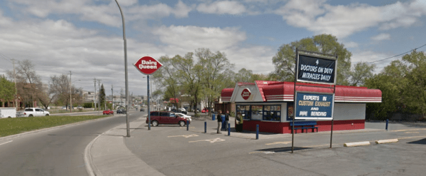
Both classic Dairy Queen signs have been removed, one from the pole and one from the store front. (Compare to Google Streetview below)
It seems a shame that we have to remove the classic signage of establishments that have adorned their businesses for so long. We have grown up with them, they are like a familiar old friend to greet us when we pass by. There is something comforting and welcoming about these classic old signs, a sentiment lost in corporate attempts to modernize.
To update a known and trusted industry brand by replacing old signs seems like a misguided attempt to fit into the modern streetscape. As the world progresses, I guess we must adjust, but why can’t we just leave the familiar old signs up and let us enjoy a bit of our diminishing city’s nostalgia.
Andrew King, 2016

I work in the area, and had been hoping that was just part of them closing up for the winter. I’ve only been here a year, and we’re already losing so many nice signs. I’m hoping the McDonald’s on Elgin keeps its neon.
The lovely woman who runs the shop told my sweetie and I that the old sign was being replaced by the new logo, and that she was keeping the old signs. So, no skulduggery here
Thanks for the update David…the old sign will be missed but glad to hear it will not be forgotten!
Thanks David – We were on Tuesday and noticed the signs were gone – we were worried the location was closing.
Andrew, I have been trying to remember the name of an old burger place on Richmond Road, out near Woodroffe Avenue, but east of that. I was a teenager then, back in the 60s. It was there well before Harvey’s moved in close by. I remember they sold small cheap burgerettes, they called them, really cheap. Sometime they were all I could afford. I remember chums in Nepean High School, who I have long since lost touch with, working there, and getting sick of all the grease!
Do you have any idea what it may have been called? Or even better, any pics? Many thanks if you could help. (Incidentally, I am writing this from rural Oxfordshire, where I have been for he last year researching my family’s history here.) Cheers, Brenda Turner
There was a Royal Burger in the 70’s but that was up on Carling just west of Woodroffe south.
Hi Brenda, you must mean Royal Burger? Not sure any photos of that location exist sadly, however this link has a photo of the location on Montreal Road: https://news.google.com/newspapers?nid=2194&dat=19610224&id=pP0xAAAAIBAJ&sjid=NuUFAAAAIBAJ&pg=4529,5143665&hl=en
Yes! Great place!
This was the Royal Burger and you are correct. It was located at the corner of Woodroffe and Richmond Road. Many times, for a treat, my family used to drive in from Stittsville to enjoy the burgers and onion rings. People would go through the drive through, then sit in the parking lot to enjoy the food as they had no inside area. There were white painted picnic tables to eat at. The burgerettes, even though small, seemed so large when I was a little girl. After our dinner we would go to the drive-in at Bayshore. Such good memories!
The new logo is a bore–DQ indeed. More revisionist disrespect for the past.
People get awfully queer about signs. I hear in Boston A larger gas station sign was made a landmark when people remonstrated over its demolition.
Rightfully so…People love old landmarks and they attract attention. It’s a nod to a time when businesses took a little extra care in their facades, rather than today’s franchises that compete with each other for the title of ‘most homogenized’.
Indeed sad..always sad to see a familiar old friend leave us.
I too noticed that it was missing (hard not to…there’s not much else on that corner). The only reason I ‘frequented’ that DQ was because it seemed the owners and I had heritage conservation in common…I hope it’s just out for cleaning.
No, it is not..they replaced it with the new “Corporate Identity Branding” sign this weekend. Blah
Come to Arnprior if you miss the old signs
I can’t edit or delete my wrong comment- I meant for this to all be one comment. Here is the SV of the current dairy queen in 2016:
https://goo.gl/maps/9ss1RVB9g4y
I’ve heard a rumour they have now closed for good, due to something being built on the property. Perhaps the auto repair place next door would know??