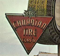
The Bermuda Triangle is a legendary triangular region of the Atlantic Ocean where hundreds of ships, planes and people have disappeared through mysterious circumstances. A far less studied triangle exists in our northern hemisphere, a triangle with its own special powers. Like a glowing, hot branding iron that has been burned into our inner retinas after leaving the womb, it is the image of the Canadian Tire triangle.

The inverted red triangle with a green maple leaf logo on top is just about as Canadian as a ketchup chip dipped in maple syrup, yet many don’t realize the story behind this simple Canadian icon.
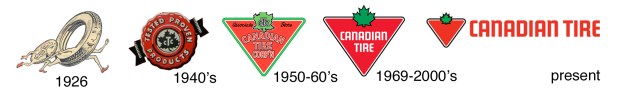
When the two brothers Alfred and John Billes opened the first Canadian Tire store in 1926, the company’s logo was a rather bizarre cartoonish rubber tire wearing elven booties dragging behind a coin character wearing the same medieval footwear. Under the slogan “The Longest Run for Your Money”, this logo of the Canadian Tire Corporation would carry on until the 1940’s when a red wax seal and ribbon logo appeared in their advertising and catalogues. This common “seal of approval” motif would continue until something happened that would live on into our subconscious: a red triangle.
THE RED TRIANGLE
Appearing around 1950, the inverted red triangle with a green maple leaf would appear and remain a symbol for the Canadian Tire corporation for 66 years, and will probably continue for many more. The original red triangle was outlined in green and included the word “corporation” shortened to “CORP’N”. In 1958 our famous collected currency known as “Canadian Tire Money” appeared at a Canadian Tire gas bar at Yonge and Church St. in Toronto. Yet it would not be the new red triangle symbol that would be the logo on the bills, but rather the original elven socked “running tire and coin” image that started with the company 32 years earlier.
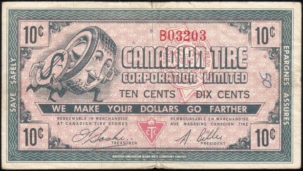
When first introduced in 1958, the CT money used a slightly updated “tire & coin” logo. The red triangle and seal are also displayed.
The now famous “Scarfed Scotsman”, Sandy McTire, who symbolized the thrifty shopper, showed up on CTC money in 1961 and continues to appear on the bills today. At one time, Canadian Tire money was manufactured at the BA BankNote company here in Ottawa, right alongside our actual Canadian currency bills, using the same inks and paper, resulting in a durable currency bill that many still have and use to this day.
THE CHALICE
The inverted triangle symbol used by CTC is actually an ancient symbol with a very unique meaning behind it. It has been the representation of the earth and water. The downward pointing triangle is also an ancient symbol of femininity, being a representation of the female womb, or a chalice…”the giver of life”. One of the four alchemical elements, water symbolizes intuition, the unconscious mind, and the enclosing, generating forces of the womb. It also represents the force of Earth or gravity, or Mother Earth. In developing countries, the inverted Red Triangle is the symbol for family planning health and contraception services, again part of the “womb” symbology mentioned earlier.


This inverted red triangle of Canadian Tire was streamlined in the late 1960’s with the company name placed inside the triangle. This would be the everlasting symbol for the company that would be emblazoned into the psyche of every Canadian.
But why a red inverted triangle? According to the Canadian Tire website, the triangle holds a “98% instant recognition among Canadians. That’s the power of the Canadian Tire triangle.” In 2012 Canadian Tire finally revealed the secret behind the instantly recognizable triangle; in a single Twitter statement they said it was chosen by the founder, Mr. Gilles:
“Chosen because our founder needed one for the front of an oil can. A triangle was a simple, easy to recognize symbol.”
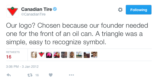
The secret behind the Canadian Tire logo revealed on Twitter in 2012.
Perhaps not as mysterious as the Bermuda Triangle, but our Canadian Triangle possesses its own, shall we say, “magnetic properties”.
Andrew King, October 2016
SOURCES
http://www.autofocus.ca/news-events/auto-retro/a-brief-history-of-canadian-tire
http://www.steelart.com/about.html
https://en.wikipedia.org/wiki/Canadian_Tire
http://www.canadiantire.ca/en.html
http://symboldictionary.net/?tag=triangle
http://www.thefullwiki.org/Red_Triangle,_Family_Planning

Thank you so very much for such an interesting and informative report !!
So much more to me, as a Logo Designer and lover of Canadian History !!
Did you know the CNR logo was designed by an artist who was ready for the graphic design when he saw his broken shoe lace on the floor one morning ? The famous “CN” brought him the Logo Competition Prize and proved his readiness to grasp the logo from the lace in front of him !! ha!
Your report is inspiring and loaded with nostalgia ! Thanks again !! ~~ John A. Cullen
That works for me! I love little stories like this thanks .
My daughter was wondering why it resembles and tomato…she keeps asking and I don’t know please help explain…thanks
The red is easily recognizable and the green is the leaf….the article explains it!
Hmmmm. Read the entire article looking for a decent explanation for the logo after seeing it on the ice of the opening Stanley Cup playoff series game between the Wild and the Jets. I’d asked my husband what the stylized strawberry represented. He laughed and told me it was the Canadian Tire logo – simply an inverted red triangle with a maple leaf on top. After my research, I still think it looks like a rather nifty stylized strawberry.
THANK YOU!! I also saw it on the ice of a hockey game and thought it looked like a strawberry!!
a red triangle is also the symbol for “anti-masonic”. WELL DONE CANADIAN TIRE FOR BEING A PROPONENT OF A TRANSPARENT/NON SECRETIVE SOCIETY.