All too often I use this blog to lament over the loss of Ottawa’s classic old signs, a trend that seems to have now finally been swayed in the other direction. I recently received some good news regarding the landmark Civic Pharmacy sign at the corner of Holland and Carling. It is has been saved and restored.
Many concerned residents emailed me about the sign when they witnessed its anchor building swathed in tarpaulins, unsure of what was happening to the building, and our beloved sign.
I am happy to report that through the efforts of the community, the sign is safe and has a positive new outlook. The thoughtful owners of the building have decided to keep and resurrect the iconic sign, returning it to its former splendour.
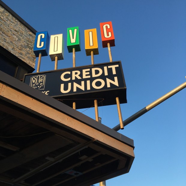
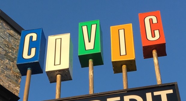
The newly restored Civic Pharmacy sign at the corner of Carling and Holland. (photo by Tina Klein Walsh)
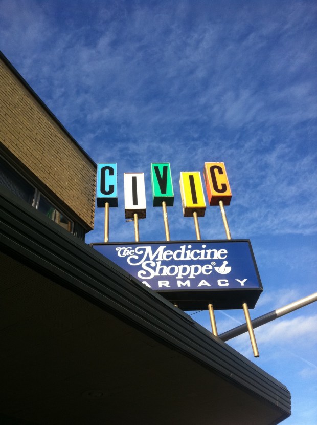
The old sign. Note how the lettering is now white instead of black.
The newly renovated landmark sign has new letter boxes, and have only altered the letters to be white instead of black, as the originals were. Also, in place of “PHARMACY” the new tenants have their business on the sign, a Credit Union. Personally, I am thrilled they kept the sign instead of throwing it out as most developers do with older signage. Despite the modifications from the original, the sign has a new lease on life and looks refreshed for a whole new generation of Ottawa residents to enjoy.
BACKSTORY
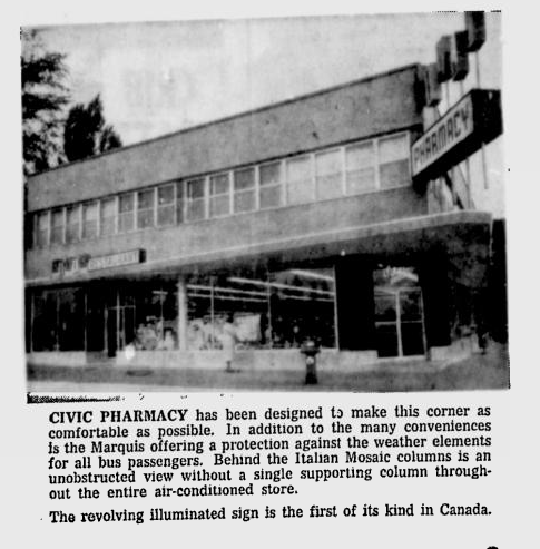
The Civic Pharmacy Building officially opened on September 17 1960, and along with it, the illuminated and animated “CIVIC PHARMACY” sign attached to its corner. The sign is inspired by “Googie” style of architecture, a modern, futurist architecture that evolved through the Atomic Age of the 1950s and 1960s. A culture absorbed with jets and the space-age inspired this style with Ottawa’s example brightly shining at the corner of Holland and Carling for 58 years.
Since the word “CIVIC” is a palindrome (a word which reads the same backward as forward) it was made into a rotating sign, with each letter rotating, and being able to be read from any viewing position. The rotating letters of the sign required much maintenance, and it stopped rotating at some point.
I was lucky enough to meet and chat with the original owner/pharmacist of the building, Wally Cherun, who told me about the history of the much cherished sign. It was the first sign of its kind in Canada, and was fully illuminated at night. Wally said a sign guy would oil the mechanics of the rotating letters regularly. It eventually got too expensive to maintain, the letters stopped rotating, and the lights burned out. The building went up for sale over a year ago, and changed hands, but luckily to someone who appreciates it. (STORY HERE)

The Civic Pharmacy Building currently wrapped in tarpaulins. (Photo: author)
PRESENT DAY
Andy Billingsley, Chair of the Civic Hospital Neighbourhood Association History and Heritage emailed me about a month ago to inform me that he went over to check on why the Civic building was wrapped in tarpaulins and relayed that the new owner of the building decided to keep the cherished sign in place. Gregg Kricorissian, another concerned resident who also appreciated the sign, established a relationship with Steve LeBrun, President of Ray Neon Signs. Steve is the son of the original sign’s designer/builder. According to Gregg, Steve has lent his full support to save the sign, and generously offered to remove and and store the sign if that became necessary. Ray Neon has provided a quote for restoration, and completed the work on the new sign last week.

HAPPY ENDING
So it seems that when some like minded people get together with a shared love of neighbourhood nostalgia, good things can happen. “It’s wonderful how our initiative to save the CiViC sign is playing out, and I’m pleased to have played a part in it.” says Kricorissian, who thinks the sign is a vital piece of neighbourhood history. “Not only is the sign a symbol of our neighborhood, but it’s also a great testament of how a small Ottawa business started in post-WWII Ottawa, and has grown to a highly successful member of its chosen industry.”
My sincere thanks to all those involved in helping to preserve this important landmark of Ottawa’s street scene. I know myself and probably most of Ottawa eagerly await the sign’s return to glory on the street it’s been quietly watching over for almost six decades.
Andrew King, Updated November 2019

This is great news.
Great news! Thanks for sharing.
That was a fun read. We have something similar here in Phoenix: an old large 50s style car sales lot sign,
That’s GREAT news !!! Let’s hope everyone follows through ! We could actually use a classic local sign museum – perhaps one or more of the sign companies could participate – it would show the work they have done in the past, the work and restoration work they can do now – a showcase for prospective clients and a walk down memory lane for those who would visit it.
Oh good. I remember that sign very well from the early 60s.
This sign is pure 60’s Jetson’s, as in George and family!
This is fun! Good work following these stories.
Good article! If only there were a t-shirt with that sign on it! That would be great!
As this is an update thank you Andrew for keeping everyone informed. I was in Ottawa in June and went to look for it. This renovated version looks great.
On behalf of @Ukrainian Credit Union Ltd. We are very happy that we were able to revitalize this sign and included it in our new branch location. In fact it was in our plans to make sure we preserved the sign from the first moment that we saw the building. We look forward to being an important part of this neighbourhood and the Ottawa community.
Regards,
Slawko Borys
Chair of the Board
Ukrainian Credit Union ltd.
This is so wonderful to hear, and on behalf of the city I think we can applaud your efforts to conserve this beloved sign. The sign will now continue to bring enjoyment to a whole new generation of residents. Many thanks and continued success as the building is rejuvenated!